Amazon Launches New Alexa App Updates and Takes Its Mobile Strategy Another Step Forward
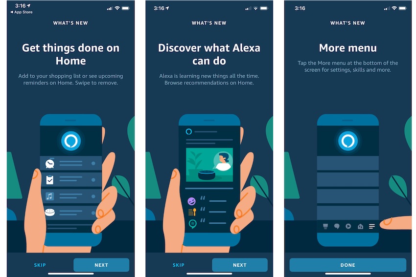
- New Alexa App puts speaking first, tap second
- Home screen now has useful reminders, frequently used features, and active session information to make the experience more personalized and useful
- Alexa App changes visual UX by moving real-estate hungry card below the fold
- Amazon added a real-time chat support feature to complement its call-back customer support
Amazon made three important updates to its mobile strategy earlier this month. First, it introduced a feature finally enabling users to interact with Alexa in the app by speaking. Before that recent update, users had to tap in the app even though they were conditioned to just speak with Alexa is in the home. Second, Amazon introduced Alexa for Apps which opens the gateway for Alexa to interact with other apps on smartphones. Alexa can now open or deep link into apps from a skill or Alexa directly. Third, Amazon created skill resumption which enables users to continue where they left off with a skill session without having to invoke the skill by name again. All of these are useful features. They are particularly important for mobile.
This missing piece was an Alexa app that gave users more reasons to use the app for interaction and not just set up and admin functions. Today’s update is a clear step in that direction. It’s not as ambitious as Google Assistant’s Visual Snapshot which launched in 2018 and provides a visual summary of your day. However, it is a clear step in that direction. Amazon doesn’t have many of the consumer services that Google provides such as calendar, email, and maps. It does know how you’ve been using Alexa, what you’ve been listening to on Audible and what you have purchased recently on Amazon.com. So, it can show that information. That small step makes the Alexa app immediately more useful than it used to be where the screen real estate tended to focus on recent activity and recommendations.
New Alexa App Moves Alexa Button to Encourage Speaking
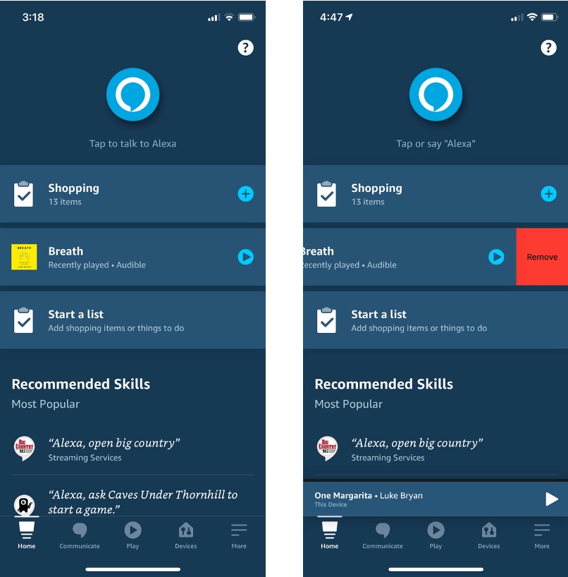
Alexa also became instantly more prominent in the app update. The Alexa button (and yes it was a button because in the past you always had to tap to speak) was small and in the bottom navigation tray. It was a different color than the other tray icons, but other than that, it was no more prominent than any other app feature. Now it is large and positioned in the top center. It is by far the most prominent part of the app.
This visual queue is likely important to remind users to ask Alexa instead of only tapping the different menus and navigating manually. You can use Alexa to change settings and save yourself a few taps. However, the more important outcome for Amazon will be if consumers start to use Alexa more frequently while on-the-go. Amazon has strong market share for voice assistant use in the home and the app its current best bet to get more usage outside of it.
The other subtle importance of moving Alexa to the top center is that it is a bit less accessible to your thumb when navigating the app manually. Consumers are accustomed to tapping icons with their thumb on the bottom of a smartphone. The top center positioning makes that a reach and likely means engaging a second hand. This may seem like a bad idea unless your objective is to get more people speaking to Alexa. That makes the reach unnecessary.
Alexa App UX Updates De-emphasize Cards
The Alexa app has relied heavily on rich visual cards since its last big update. Cards may be visually appealing but they also consume a lot of visual real estate which ultimately means you can show less on the screen without forcing a user to scroll. The update offers a view of three shorter, screen-width tiles which can be accessed via speech or tap. They can also be dismissed by sliding left and tapping “remove.”
Below these “notifications” is “Recommended Skills” where Amazon today is promoting what it says are “Most Popular” skills. This appears to be partially customized and partially games that Amazon would like to drive up awareness around. When you scroll down a full screen you are introduced to your first card which is a recommendation to create a “Start My Day” routine. This may be different depending on the user, but in general there are a series of cards that promote a variety of Alexa features and third-party skills. The change in the home screen shows that Amazon is actively migrating its visual real estate toward items you might need or activities you might want to continue as opposed purely reporting what you have done or recommending new things. It’s a smarter UX than the previous version.
Real-time Support Chat Shows Customer-Centric Mindset
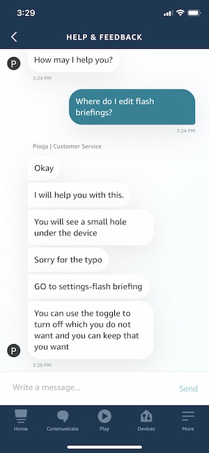 Another new feature is real-time chat support. The previous version of the Alexa app offered a callback support request and email. With the new update, email is replaced by real-time chat. I took a test drive and asked a couple of questions. My chat was active within about 30 seconds of my initial request and my first question was answered within a minute or two.
This is a particularly noteworthy feature for Alexa as is the callback support. It’s a mass-market device with hundreds of millions of users. You would think that Amazon would not want to take on call center expenses for this type of device but the presence now of realtime chat reinforces how important Alexa is to the company. Amazon wants every Alexa user to get what they need quickly. Ideally, Alexa would answer the question. If not, bring on the humans to keep customer satisfaction high.
Getting More Alexa Engagement On-the-Go
Amazon has made tremendous progress in the home with Alexa. It is first or second in market share in each of the countries where it competes. From that perspective, the first phase of the Alexa strategy is a clear success. But, Amazon’s goal is “Alexa everywhere.” Now Amazon must leverage the customer base and goodwill it built up in the home and translate that to spaces outside the home. Smartphones and cars are the next big markets it needs to conquer and each has entrenched competitors that want to keep Alexa out.
Amazon made tangible progress on the automotive front last year with its first embedded assistant using Alexa Auto. Starting in 2017, Amazon began getting Android smartphone manufacturers to include it as an option for the mobile voice assistant. A company spokesperson told Voicebot that Alexa can now be set as a default assistant in a dozen smartphones available in North Ameria, Europe, and India. A more useful mobile app may be a more meaningful step given that the top-selling smartphones are not likely to allow Amazon as a default assistant choice, but they won’t bar it from being an app on the device. The seeds of that strategy first started to become tangible in July 2020.
Follow @bretkinsella Follow @voicebotai
Amazon Lays Out Alexa’s Future, Adds 31 New Features for Voice App Developers at Alexa Live


