Versa’s Website is Not Just Conversation First. It’s Conversation Only
Versa is a digital agency headquartered in Australia. While the company has a history of implementing traditional mobile and web projects it is focused today on projects that implement conversational AI capabilities. Kath Blackham, CEO of Versa, wanted the company’s front door to reflect that focus and expertise. This objective led to a radical change in the company’s website.
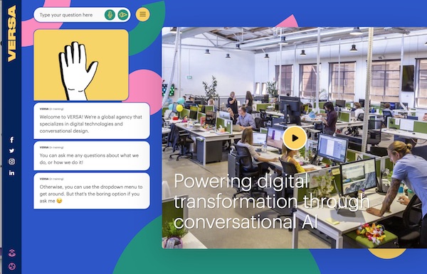
When you arrive at Versa.agency, the video on the right seems like a natural placement although it is not quite the typical convention of having a full-width hero image video at the top. However, you will immediately notice two elements that are unusual in current website design trends. The left quarter of the page is a column consumed by a waving hand gif above some text bubbles that offer some high-level information about the agency and encourage the user to start typing or speaking to learn more. The second and arguably more unusual difference? There are no menus.
A Fully Conversation-Driven Website
There is something that looks like it might be a hamburger menu in the upper left, just to the right of a text input box. However, when you click or tap on it you get “chips” which streamline your input into conversational navigation. The text input box also has a microphone and serves as your gateway to learn more about Versa whether by typing or speaking. It is the only way to get information from the website. When you do, the video on the right is replaced by traditional website page content that answers the user’s query. Conversation on the left. Response on the right.
“Since we are focused on digital transformation driven by conversational AI, we wanted our website to reflect that vision,” said Kath Blackham, CEO of Versa. This move was considered risky by many at Versa since users have expectations about what websites are and how they are navigated. There is also a lot of knowledge today about what works with visually-driven websites. There are no conventions for the conversational navigation of website content. The obvious concern would be increased abandonment rates because visitors were confused. Blackham said:
Not everyone on the team was on board with this strategy. But, I thought it was very important to do something that would show people how conversation AI could work.
This is not a conversation-first approach. The website is conversation-only. You must use the conversation box to type or speak your question. Companies like Cashew.ai place their chatbot right in the center of their website home page which itself is novel. It uses the entire hero image space to entice users to engage with the chatbot. However, it also has a traditional top-of-page anchored menu that allows website visitors to navigate by click or touch. Versa made the radical decision to eliminate all of those visual navigation conventions.
What Versa Has Learned
“We first had to learn how to create the links between the content and the bot…We spent months building out content,” said Blackham. However, they quickly learned that these efforts weren’t actually covering the full range of questions visitors wanted to answer. “People were searching for things not on the website. We have been adding edge cases for people asking particular things.”
Initially, this involved close monitoring of the bot sessions to analyze conversation errors and unfulfilled intents. Versa today has someone reviewing requests two times per day and updating intents. This process has surfaced a number of questions that were not getting answered for website visitors. Many of those visitors in the past might have simply left and not returned. Increasingly, those more specific and previously unanticipated questions can be answered because Versa has the benefit of crowdsourcing the topics that matter to visitors. “There is more context coming in and more pages personalized to that topic…It is more successful at pushing people into a funnel.”
Another capability Versa had to learn more about was “rendering content on the fly based on bot conversations.” In a traditional site map, each click has one and only one target URL for resolution. With conversation, once you have the intent there might be multiple pages that can answer the question which means the system needs to choose the best option. In addition, you want the page to load quickly so the user can quickly see the fruit of their conversation.
A Blueprint for a Truly Conversational Web?
Earlier this year, Voicebot’s Voice Insider newsletter considered why the web has been largely ignored by the voice and conversational AI industries. It is a far larger digital surface area than mobile and there has not been a significant improvement in website design or performance in a decade. Plus, people are using their computers more often to access websites as they continue to be stuck at home since the onset of the global COVID-19 pandemic.
One reason for lack of progress in building a more conversational web might be that website developers don’t know it is a viable option. And, many early chatbot implementations might reinforce this thinking because of their very limited capabilities. Another reason may be that web designers don’t know how to incorporate conversational capabilities. Blackham admits that this has been a learning process for her agency and that we will likely see a lot of evolution beyond their current design in the coming years. With that said, Versa just might be offering the blueprint web designers need to finally see what’s possible and where to start.
Follow @bretkinsella Follow @voicebotai
U.S. Bank Launches Mobile App Voice Assistant Built to Mimic Human Bank Tellers
Bank of America’s Virtual Assistant Erica Explodes in Popularity