What Makes a Great Bixby Capsule? A Bixby Evangelist Offers Tips on How to Succeed in DevJam Contest.
From October 18, 2019 through December 9th, 2019 Samsung is running a contest for the Best Bixby Capsule (i.e. voice app). The grand prize is $10K and entrepreneurship coaching by Adam Cheyer. Runners up receive $5K and there are 25 $1K prizes. The first 250 capsules approved get a $300 Samsung store credit. You can qualify and win this prize for up to four different capsules.
Last year I won the top prize in the Bixby developer contest and realize that most other developers don’t know much about the voice assistant and how it is different from Alexa or Google Assistant. So, in the spirit of helping developers maximize their chances of competing well in Bixby DevJam, I put together this post to offer some tips. Applying these ideas won’t guarantee success in DevJam, but they should increase your odds provided you bring a great idea to the table.
The Opportunity with Bixby
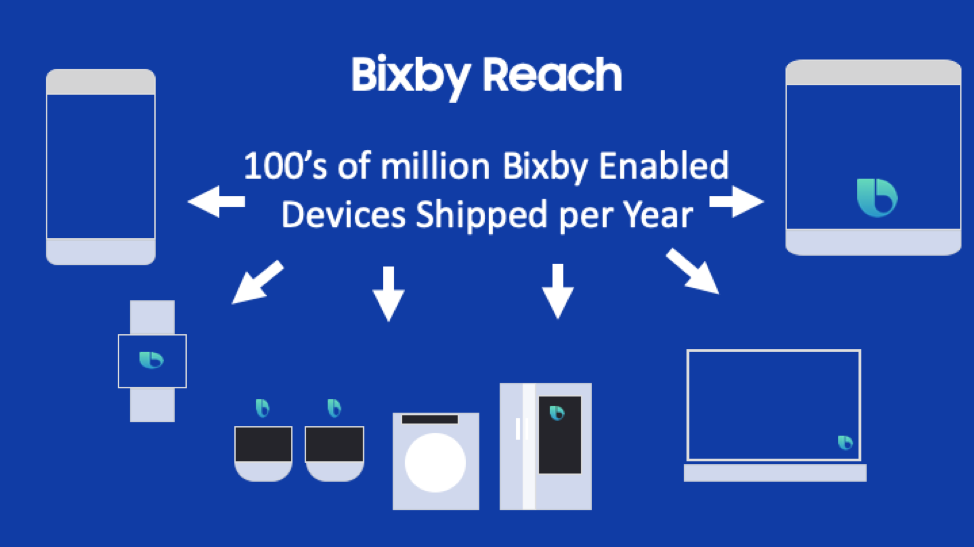
Bixby is Samsung’s voice assistant and is available on 100’s of millions of phones and tablets. Beyond phones and tablets, development for televisions (Samsung is the world’s largest TV manufacturer), appliances and watches is now available. Bixby gives you a massive opportunity to leverage the huge Samsung ecosystem. Seventy percent of US households have a Samsung device.
Building a great Bixby Capsule
There are many guides and tutorials around building a great voice / intelligent assistant application. The best practices around conversational design, voice development and QA all apply to Bixby as well as other voice assistants.
This article will highlight how to build a great Bixby capsule (Capsule = voice application, the equivalent of an Alexa Skill or Google Action). There are many areas where Bixby design and development differs from Alexa and Google Assistant development. Building a great capsule means leveraging the unique capabilities of Bixby and using them to create a compelling user experience.
Multimodal
Bixby is a multimodal first assistant. Currently and in the future, the majority of devices running Bixby will have a screen. As such, unlike competing assistants where building a multimodal experience is optional, building a multi-modal experience with Bixby is not only expected by end users but a requirement of our capsule review process.
Multimodal development for Bixby consists of several components highlighted in the blown-up view of the Bixby Yelp mobile capsule below:
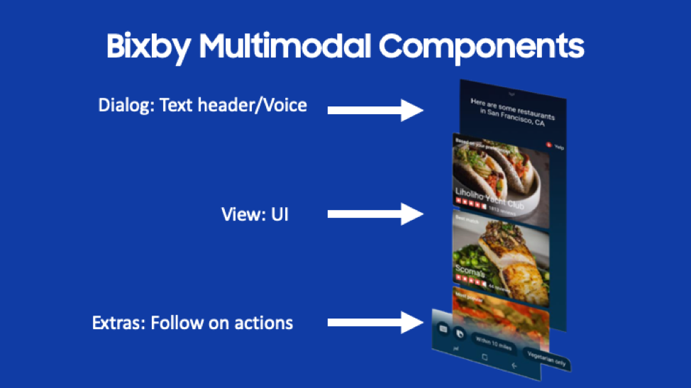
The top/header is the Dialog. This is the text you with to communicate to the user. This should be concise and make it clear to the user what to expect. In this example, the user asked the Yelp capsule “Find some restaurants in San Francisco”. As you can see, the dialog here echoes the user’s request and lets the user know their question is being answered.
Note: When developing the UI dialog, the speech is also defined. By default, the dialog shown is the same as what is spoken but you have the option to make it different. This is often desirable – see the hands and eyes free discussion below.
Below the dialog is the main UI. Rich UI’s are built using the Bixby Views UI framework. There are two primary types of views, an input view and a result view.
An input view allows one to use form elements for typed in input as an alternative to voice. Aside from allowing user choice, a UI input field is sometimes preferable – think e-mail addresses for example.
A result view is used to show a rich UI of results. The view in the picture above is restaurant results from the Yelp capsule. In this example, cards are used to provide a graphical and text-based layout for a list of restaurants. There are a rich set of UI components available to drive result views.
Finally, the bottom area is for follow on actions. These are optional and used to prompt the user with a next logical step. These are akin to the suggestion chips used on other voice and chatbot platforms.
Any development you do using Bixby views will work on mobile (phones and tablets), televisions, smart watches, appliances and any future Bixby devices.
Developing for Bixby includes design and development of UI’s. Users expect a multi-modal experience and the very best Bixby capsules have attractive and well thought out UI’s that are compliments to the voice experience.
Supports Hands and Eyes Free
Bixby runs in two modes: Hands-on and HEF (hands and eyes free). On a mobile device using the Bixby button launches the hands-on mode versus using the wake word “Hi Bixby” which launches the HEF mode. The idea behind HEF is the user may not be able to touch the screen (think in an auto) or may not be able to even see if across the room from their phone, etc.
As a designer/developer you have complete control over the variations between the HEF mode and UI mode. The experience may vary or be the same. There is definitely an art here to combine a visual UI and a voice experience and varying the voice experience if in HEF mode. The complexity and flow of your capsule will determine the best options.
Great Bixby capsules often have more abbreviated voice content when in UI mode and often provide a full voice only experience in HEF mode. You definitely open up both the possibilities and context of where your capsule can be used by doing this as well as enabling an optimized user experience.
Support Rich Conversational Experiences
Bixby has powerful NLU capabilities that allow rich conversational experiences. Take this example:
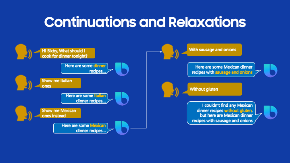
In the example above, the user is using a recipe search capsule. There are several conversational features of Bixby highlighted:
- Note when the user says “Show me Mexican one’s instead” Bixby is contextually aware the user is still searching for a dinner recipe but wants to search for Mexican instead of Italian. This type of replacement is modeled in Bixby by a continuation. In your NLU model, you identify the utterance as a continuation, and Bixby will automatically replace the previous input and rerun the search query, no development required.
- “With Sausage and Onions” is modeled as a continuation as well but with different behavior – here the user has added multiple qualifiers (concepts in Bixby terminology) to the search. Again, Bixby will contextually remember that it’s searching for Mexican dinner recipes but rerun the search query with the added qualifiers – again automatically without development required.
- Finally, in the last example, the user adds “without gluten” to the query. Unfortunately, the search query returns no results. But instead of disappointing the user with no results, the user sees the previous results and Bixby lets the user know there are no recipes without gluten available. Bixby dropped a query parameter (you define which one) and gave a friendly message to the user. This is modeled in Bixby as a relaxation.
When doing conversational design for your capsule, you will likely find several places where usage of continuations (and less often but often valuable relaxations) enable a more natural, flowing and human style of interaction.
Personalization
Voice is an excellent place to use personalization to make a capsule simpler and more intuitive to use. In our natural human conversations, we use personalization all the time – our knowledge of the person we are talking to and the context makes this easy and leads to a natural flow of conversation.
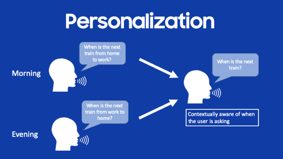
In the simple example below, personalization is used so a user no longer needs to define the departure and arrival station in a train schedule capsule. Instead, Bixby’s personalization is contextually aware of the user’s behavior in the morning going to work versus the evening returning home.
Bixby supports two types of personalization:
- Preference Learning: Surfacing a preferred option from a long list of results based upon the user’s behavior. This is based upon user behavior over time and context. An example with a restaurant search capsule would be prioritizing the list of restaurants based upon the user’s favored cuisine. For instance, if a user selects more Chinese restaurants than others, a capsule with preference learning will show Chinese restaurants as the first search results.
- Selection Learning: Automatically selecting an option based upon user behavior. For instance, if a user typically selects a particular class of ride in a ride-sharing capsule, the selection will be automatically made for them when selection learning is enabled. Selection learning can be based upon either individual user behavior or behavior of the community using the capsule
Personalization makes an interaction with a capsule “just work better.” It also adds a humanlike ability to predict and understand the user. A capsule with personalization enabled will work better and better the more the user uses the capsule. The beauty of personalization on Bixby is it’s all model driven – a few lines of model configuration and it’s enabled. You should strongly consider enabling personalization in your capsules.
Utilize Library Capsules
Bixby library capsules are built-in functionality that can dramatically reduce the amount of coding and modeling necessary. They are essentially pre-built code modules that provide often needed functionality. Library capsules use also provides consistency across capsules – using the same library capsule in two different capsules provides consistency in user experience and expectations across the capsules.
There are many different library capsules but highlights include:
- Audio Player: Support for full fidelity audio playback and playlists. This is used for long-form audio e.g. music, podcasts, news, etc.
- Geography: Support for specific points and regions. Points are specific locations whereas regions are areas e.g. a city, county, state or arbitrary region defined by the capsule. Bixby’s natural language supports a geography search term which includes place names e.g. a user can say “Empire State Building” or “Golden Gate Bridge” and Bixby will understand.
- Location: Natural language and UI support for auto completion of addresses and locations
- Date Time: Deep support for date and time concepts including natural language support for expressions e.g. “last month”, “last year” or “Christmas 2030” etc.
- Profile: Access (with the user’s opt-in) to the user’s profile information including name, contact info and address book information
Library capsules are used extensively in Bixby capsules to enrich functionality with the bonus of cross capsule user experience consistency.
Making Your Capsule Stand Out in the Marketplace
End users of Bixby enable a capsule using the Bixby Marketplace. The marketplace is akin to the Alexa Skills store or a mobile app store. A capsule’s marketplace listing is driven by metadata specified in the capsule.bxb, capsule-info.bxb and hints.bxb files.
You should put care and effort into this metadata. Your marketplace listing may be the first place people will encounter your capsule and where you want to entice them to enable and use your capsule. It is all too common for significant effort to be made on capsule development and design without a commensurate effort being made on the marketplace metadata. Some tips and tricks for marketplace success include:
- Choose an easy to remember and understand dispatch name. If your dispatch name doesn’t work, users can’t use your capsule. Dispatch names should be short, easy to remember and speech recognition friendly. Make your ASR speech recognition friendly by avoiding homophones, sound similar and made-up words. The sound-alike functionality at rhymezone.com is great for avoiding sound similar words.
- Test your dispatch name, hints and training phrases with voice – use the voice input in the simulator and on-device testing. Make sure this works well.
- Choose easy to remember hints. If your capsule name is was “Quotes Machine” a great hint might be “Ask quotes machine for a quote” or “Ask quotes machine to start” or “Ask quotes machine to begin.” A hint to avoid would be something like “With quotes machine, ask quotes machine to give me a quote”
- Spend time on your capsule description, icon and other data in the marketplace. Consider this part of your capsule an important marketing effort.
- Provide a way for users to contact you – including your website in the capsule metadata and consider providing a capsule specific email in the capsule description. You want to hear what users like or dislike about your capsule.
Getting Started
Get started with Bixby development by going to www.bixbydevelopers.com and downloading the Bixby Developer Studio (Mac, Windows, and Linux). Two great resources for building your capsule are the new templates built into the studio and the example code on Github: github.com/bixbydevelopers.
Above all, create something that is fun and/or usable. Think of something that a voice assistant would be a good use case for. What is a task that unlocking your phone, finding and launching an app and then swiping and typing is onerous or takes too long? What’s an interaction that works best and easiest via voice? Those are good candidates for a capsule.
And remember, submit and get a capsule approved between October 18th and December 9th, 2019 and be eligible for many awards including a $10K grand prize. See www.bixbydevjam.com for more details.
Now go build something amazing!
Bixby Views is What Every Voice Developer Wants and Reinforces Samsung’s Biggest Differentiator
