
Voice Design: A Guide to User Onboarding

As voice design guidelines flood our Twitter/ Medium feeds this year, one key theme that’s emerged is the importance of ‘being brief’. Developers and designers alike are shying away from lengthy explanations for fear of boring users before they’ve gotten further than your LaunchRequest.
This is a serious consideration, but frequently, in their quest to be brief voice designers have fallen into a trap at the other end of the scale–being so brief that the experience is unclear, and users struggle to understand the conversation. With increasingly more Alexa skill enablements occurring by voice alone (or being auto-enabled), you can no longer assume that a user has read your beautiful skill description on the store.
Onboarding is a retention deal breaker. If users are alienated within their first use, it will dramatically reduce the likelihood that they will return. Onboarding is also key to managing user expectations. The voice landscape is evolving daily and your average user may not entirely understand what the technology is capable of, let alone how/how much you’ve harnessed for your particular experience.
1. Opening instructions
For basic voice apps with only one or a few interactions, onboarding may be as simple as a short instructional welcome message for a first time user.

From this, we understand that the Headspace Alexa skill has two core pieces of functionality: listening to a meditation or sleep specific audio.
However, opening instructions are not always enough. This is when the clash between brevity and clarity comes to a head. Relying on a single message for your instructions, whilst also trying to be brief, can result in a confusing first session for users.
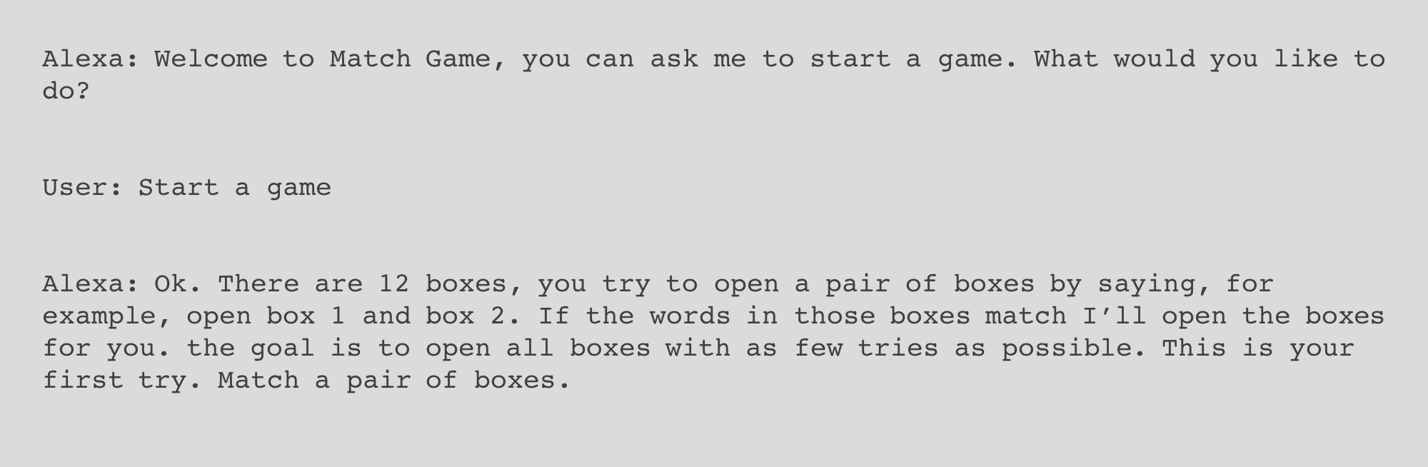
Putting aside the redundant opening question, the game instructions here require a little thought before they are understood. This is particularly true if the user has no idea that this is modeled on the familiar game, Concentration. But by the time you might have processed how to play, you‘ve potentially missed your chance to give a response and have wasted your first try. This type of ‘tutorial by exposition’ is dangerous; it relies too heavily on the user wanting to play enough times to understand how to play. The best voice experiences should be making sure that this understanding takes place in the first session.
2. Indicate progression
Assume that your user theoretically understands what they can do with your voice experience. How do they know how long it will take to do it? And for the creators of the experience (i.e. us), how can we be sure that a user completes everything you want them to?
The “need to complete” is a powerful psychological driver in video games, and is highly applicable to complex voice experiences- whether you’ve built a game or not.
In a traditional GUI, progression indicators are displayed visually to indicate that the user is on a learning journey that they will want to complete. Whether your first experience is a lengthy sign-up flow or a tutorial of your product’s key features, progress can be displayed in elements such as trackers or negative space to indicate unfinished tasks. LinkedIn offers a great example of this.
But when it comes to voice, the absence of visual cues means that users enter into an interaction with no idea of how long it will take for them to complete the purpose of the experience, whether that purpose is finishing a game or receiving a medical diagnosis.
For some experiences, this is fine. Would You Rather excels by running endlessly. Your session ends when you get bored. There is only one task to complete: answer identically formatted questions. Onboarding users to teach them how to answer a question would be patronizing, and telling them how many questions they have left would be disadvantageous. But sparce onboarding is a privilege specific to flat voice experiences; there is no user journey, no fulfillment and no real reward.
Excluding examples like Would You Rather, voice specific progression trackers are usually necessary to prime a user. For games that have a finite number of questions, this can be done quite simply–tell the user as early as reasonably possible the number of questions they can expect. Then signal where a user is during the game, for example by telling them how many questions they have left, or that they’ve reached the final question.

Song Quiz prepares the user to answer 7 questions, after listening to 7 short clips of music. Although we don’t know how long each ‘short clip’ is, after the first song we can have a pretty clear idea of how long a game probably will last. Throughout the game, you hear what number question you’re on, and the final question is announced by a catchy bit of music.
3. Contextual tutorials
So far, so good. Set out simple instructions at the opening, give new users an indication of session length. But for voice experiences that aren’t games, it can even trickier to explain what a user can do, let alone how far they are from understanding the product’s full functionality. How do you show a user around your product with voice?
This is where the video game walkthrough comes in. When building the original Life Bot skill on Alexa (sadly now discontinued), onboarding was not something we designed until a few weeks after launch. It was only after user testing that we realized people didn’t really understand how to navigate through our functionality.
The product had 5 core features: you could 1) text a reminder to your phone; 2) find your phone; 3) practice a meditation; 4) practice desk yoga; 5) set up a news feed. This was a complex feature list to navigate through by voice alone, so we devised a couple of ways to tackle this.
1) New user contextual tutorials
We designed a series of tutorials that would greet a user the first time they tried out one of our five features. We alerted the user that they were entering an onboarding tutorial with some simple messaging.

We then walked them through the process, set up as normal but accented with extra words of encouragement and guidance. Life Bot became more than just some functionality that users could access through their Alexa device. We developed a new personality, an assistant within an assistant that guided users through the skill’s functionality before letting them run wild.
Rather than bombard users with a twenty-minute long onboarding explanation of the whole product, we chose to create organic tutorials that would only surface when the user chose to use a feature that was new to them. To ensure that they did try other features, we used other channels to nudge them–mainly email and mobile.
2) Integration of mobile + voice
Life Bot was one of the first Alexa skills to ask a user for their phone number via voice. It was a bold choice, but it paid off. Once we had a user’s number, we could use texts to complement our onboarding system. Finished a tutorial? Get a congratulations text! Only tried out one feature? Why not try another one?
As well as a positive confirmation, onboarding texts included a progression count, letting them know how many of the tutorials they had completed. In this way, users knew from their first session exactly how to use the skill and how many features they hadn’t tried yet.
Onboarding in voice design: Do it, but don’t over do it
It should go without saying that there is definitely such as thing as ‘too much onboarding’. It’s something that countless video games have been guilty of–the desperation to help users resulting in hours of passive play before they could finally play for themselves.
In the same way, user onboarding does not have to mean clogging your voice design with unnecessary words. Brevity should always be a key consideration in voice design. Voice design is about creating a conversation that flows, and writing long, instructional speeches will not achieve this. Onboarding should be subtle, contextual and restricted to new or quite new users. Done well, it can have a significant impact on both retention and user experience.
“Jess Thornhill is a Voice Designer and Product Manager. She has worked with several successful voice developers and was a core member of the Opearlo team during their time at YCombinator in 2017. Jess has since worked with clients at all ends of the voice activation spectrum, from upcoming writers to one of the most popular Alexa games in the skill store. She has also published her own skills; the most recent, Kid Chef, has been shortlisted for a bonus prize in Amazon’s Build a Game for Alexa Challenge. Prior to her work in voice, Jess worked in Accenture Digital’s Innovation and Emerging Technology team as a UX designer and Product Manager.”
Voice UX Best Practices eBook – Over 100 Insights from 17 Experts
Voice UX Best Practices with Emerson Sklar from Applause – Voicebot Podcast Ep 66