Google Home Rolling Out New Interface
The new Google Home Hub smart display was introduced yesterday as a device that will help you manage your smart home devices more easily. It’s one day later and the Google Home app is getting a makeover to make it easier to navigate. The new “home” screen has four buttons across the top: Play, Broadcast, Add and Settings. Placing broadcast right up front is an interesting idea since you do really need a button for it. However, the positioning is likely to remind people they can use it and make it accessible through the mobile device.
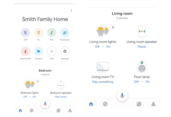
You can also add devices to the tray and it shows you what devices you have assigned to various rooms in the home. Finally it is nice that the settings are available through the tray instead of hidden. The three dots now only take you to “Help” and “Feedback.” Everything is is more easily accessible through the Home, Explore, Play and Profile buttons in the lower tray. This is not quite as robust of a control panel as was demonstrated for Google Home Hub, but it is a simplified flow for users looking to access and control configurations for smart home devices.
Follow @bretkinsella Follow @voicebotai
Amazon Files for Patent to Detect User Illness and Emotional State by Analyzing Voice Data
Google Home Hub $149 and Available in US, UK and Australia on October 22nd