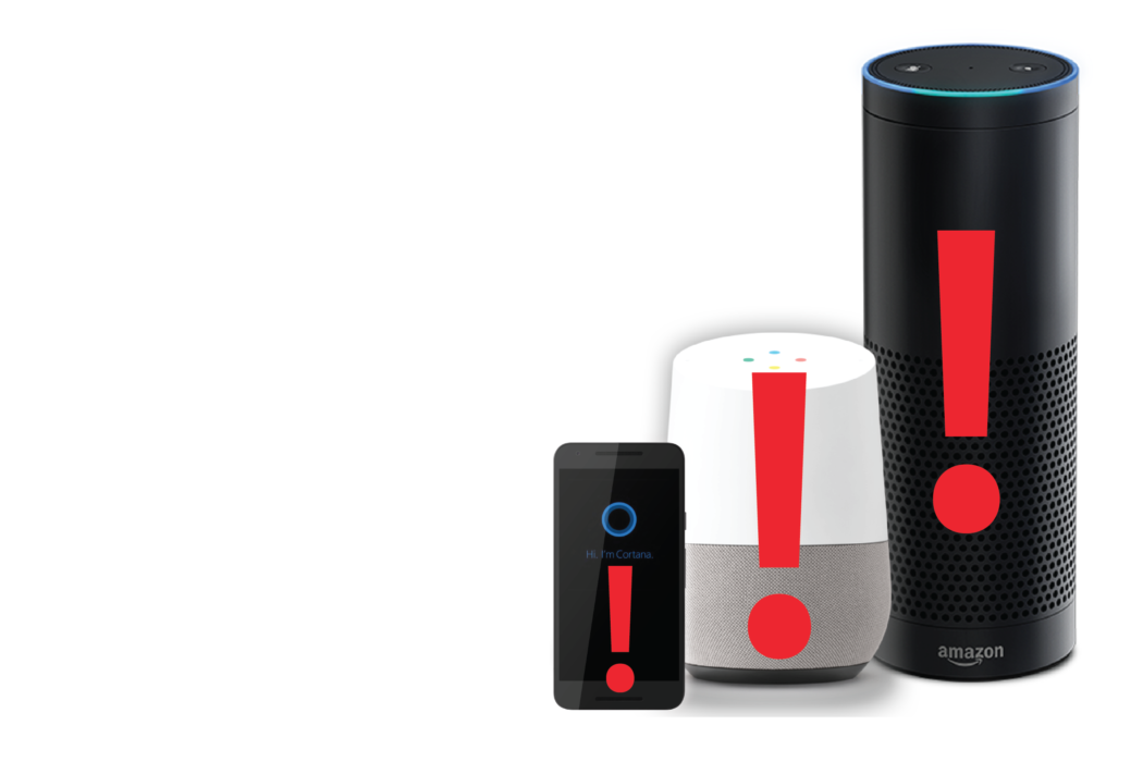
Avoid These 11 Common Mistakes When Building Voice Applications
Now that voice applications such as Alexa and Cortana Skills and Google Actions are proliferating, there is increased discussion about best practices and common mistakes. Voicebot reached out to 11 experts in voice application design and development to find out what you should avoid. Our goal? Fewer voice applications that suck. Here is the question and our expert answers.
What is a common mistake that voice application publishers make that undermines the quality of their apps?
Jess Williams, Opearlo
Not running a beta test before publishing the voice app. The new Amazon beta testing tool makes this really easy and it’s a great way of identifying any weaknesses in the voice interaction model.
Dan Whaley, Sabio
Number one issue is with the use case. Failing to think about whether the task suits voice as a medium. Many tasks are either too complex or rely on visual hierarchies and relationships that make it difficult for the user to understand the feedback and achieve their goal on a voice interface. A classic example is flight bookings. A good rule of thumb is, if you can’t (or wouldn’t want to) do a task while washing up, it’s probably not a great use case for voice.
Paul Burden, Our Voice
Voice assistants respond almost immediately to simple queries like the time of day, weather, today’s headlines, and so on. However, when interacting with a skill that requires more time to respond, users can get impatient. As such, they frequently interrupt thtzae process by blurting out, “Alexa.” This of course terminates the previous process as the Echo awaits a new command.
Here’s a specific example. The Washington Metropolitan Transportation Authority (WMATA) has a fantastic skill that provides real time updates on the Metro subway system. To query WMATA, the user says, “Alexa, ask DC Metro when the next train arrives at the Bethesda stop.” The Echo usually responds in 8 or 9 seconds. It doesn’t sound like much time, but users often interrupt the process. I’d recommend adding functionality enabling Alexa to respond to the interruption by saying something like: “Do you still want me to get the Metro information for you?”
Jo Jaquinta, Tza Tza Tzu
Verbosity. You can’t fast-forward, skim, or skip past content in an audio stream. You have to listen to all of it. So when a voice app drones on with an overly long response the users has to either resentfully sit through it, abort the app, or just forgets the first half of what is said. Replies have to be terse and crisp, and deliver the most compelling information possible. But they should also allow access to more information to let people dive down on precisely what they want (You can learn more on this topic through Jo’s tutorial).
Scott Werner, SaySpring
As far as common mistakes, I think the biggest one I made early on in a project and the one I see a lot of people make when they get started is not prompting their users well with what they’re able to do. To me when I’m building and spending a lot of time thinking about an application, a question like “what would you like to do next?” or “what else?” is fine, because I’ve memorized all the available things my skill or action can do. But, to most users they don’t have that kind of familiarity with the skill and can easily get lost.
Adam Marchick, VoiceLabs
I think the understandable issue is the voice application publishers try to do too many things in version one. Given conversational AI is so powerful, it is enticing to try and offer 10+ features and functionality.
My recommendation is to release 1-3 key features that you think will resonate and bring daily and weekly habit, then analyze the Voice Pathing to see how my consumers are successfully navigating the skill, evaluate your Speech Finder to both ask where people are getting confused and what additional functionality people want, and plan to evaluate your retention metrics weekly. Many of your users are figuring out how to use these two screens together to quickly improve their application. Once you have a successful ‘sticky’ user experience, then add your next five features. Voice programming is much more iterative vs. mobile or web.
Pat Higbie, XAPPmedia
Giving users too many choices on any single turn of a conversation. Voice is different from web and mobile because the user needs to remember the choices provided in order to respond effectively. So, it’s important to limit the choices on any single turn in the conversation to 3 or 4 at the most.
Stephane Nguyen, Assist
Voice application publishers try to build tree flows, which function like IVR systems. This is not how people converse in general, specially over voice. How many times have you change subject during a conversation with your friend: “Oh by the way, I think I don’t want to go to this restaurant anymore”, while talking about another thing. This comes back to the article Shane (our CEO) has published. You should never have to “go back” to the restaurant step to change your mind.
Ahmed Bouzid, Witlingo
They don’t fully understand that the voice medium is fundamentally different from the visual/tactile interface. In the visual interface, you can have as many options as needed, and you have devices such as drop downs, checkbox lists, radio buttons, and images to guide the users. The list can be as long as it can be and the cognitive load on the user is minimal. They can quickly scan the options and make a decision. In voice, the spoken word is linear, and so:
- Users have to wait for the options to be read one at a time
- They need to remember what the options are, [which means] that users need to remember, creating cognitive load
- Users can’t find out about the meaning of an option without disrupting the flow (no hovering over a question mark to find out what the option means)
Worse: Voice is ephemeral and doesn’t persist – so you can’t easily pause the interaction and get back to it later. For example, you are leisurely filling out a a mortgage application form on your comfortable laptop and someone rings the bell. In the visual interface, you can just go ahead and answer the door and then come back and pick things up where you left off. A quick scan tells you where you were and what’s left to do. In voice, you just can’t do that without enduring a horrible experience.
Nick Schwab, Independent Developer
Giving users a lengthy response is the most common pitfall that I see in voice applications. For most apps (with the exception of games and news-related apps), users don’t want to be forced into hearing more information than they need. Prompting the user for if they would like additional information is often better than assuming that all your users will want the extra information.
John Kelvie, Bespoken
Not keeping a close eye on their voice apps once they go live. Outages lead to bad reviews from customers, and no publishers wants that – whether they are a hobbyist, brand or enterprise. Even if the cause of the outage is outside the developer’s control, knowing what is happening and mitigating or resolving it as quickly as possible is essential.